We’ve said it many times before, but a clear and enticing call to action on your website really does make all the difference between a potential customer taking the steps you want them to take when they land on your site and turning back to the search results page. In the following paragraphs, we recap what a call to action is and why you need them on your website. Plus, we provide some tips on how to write a persuasive one that will deliver results. We’ve even included some good examples so let’s delve straight in…
What is call to action?
In the world of websites, a call to action (CTA) is a digital marketing strategy to get website visitors to take a desired action. A CTA is a short piece of enticing content that directs website visitors to click a link that will lead them to a landing page where they can learn more about the brand/product/service in question, and in some cases, make a direct purchase.
It might be that you want your web visitors to request a call back, an information pack, or you want them to request a quotation from you. You may just want them to simply get in touch so you can chat things through directly (which is the case for many of our clients). We often write call to actions that direct website visitors to a contact form, from there our clients can follow up on these leads and hopefully, turn them from website visitors into paying customer.
Call to action’s often appear as a banner, pop-up box, or button on a website.
Why do you need a call to action?
How else will be able to invite your visitors to do what you want them to do? Whether you want them to call you, leave their email address, read your latest blog post, tell them about a discount, fill out a form, or you want them to request a quote from you, a CTA will allow you to persuade them to take the action you want them too before they click off your site back to the search results page and onto one of your competitor’s websites. A good call to action will:
- Generate leads for your company. The majority of businesses we work with use CTA’s on their website to identify their target audience and generate leads – potential customers that have an interest in what our clients are offering and are likely to become future customers. Companies will create an email or call list from this group to continue to market to them directly.
- Make a sale. Effective CTAs have a high conversion rate so, all those leads you’ve gathered will soon turn into profit.
- Build a customer base. CTAs are often used by companies on printed marketing materials or splashed on their social media channels with the aim of directing people to their website. This way companies build brand awareness and get more people to learn about their company and products.
- Create a direct path to your product or service. A CTA makes is super easy for someone to find your website. With just one click a potential customer can be on your desired web page. We have seen this a lot in recent months with QR codes making a fashionable comeback.
How to write a good call to action for your website
Whatever your call to action is, it needs to be clear, compelling, and visible from the moment someone lands on one of your pages. Use actionable language to convince users to do what you want them to. Essentially, for many of our clients, their website is a lead generating machine so their CTA needs to be well thought out and easy to find – it will make a huge difference to how many leads you generate through your website. Here are a few rules to follow when writing a call to action:
- Get straight to the point. Be concise and clear with your words so a user knows what to do (and how to do it) as quickly as possible. No waffling. Using a well-placed CTA button with a simple ‘request a quote’, ‘read our blog’ or ‘contact us today’ can help keep words short, sweet and obvious.
- Help the user relate to the product/service you are providing. The best way to do it? Provide answers to questions they might need answering. For example, when a visitor lands on the Make Me Local homepage they are immediately seeing that our services will help businesses use their website to generate leads and make money. This is followed by three prominent calls to action ‘what we do’, ‘how we work’ and ‘get in touch’ all of which help the visitor to find out how we can help them further depending on their intent. Our services are quite detailed, so our main aim is to get website visitors to ‘get in touch’ with us so we can chat through their needs directly – hence, why we have positioned this call to action – top right of the screen.
- Use actionable language. When you are trying to convince a person to do something, you have to be authoritative. Good call to action phrases include: “join our club”, “request a quote”, “contact us”, “click here” that clearly point users in the right direction.
- Make it low risk. A good CTA will promote something valuable to the audience with low associated risk. Your audience needs to be reassured that by pursuing your CTA they will not be pressured into anything. This often translates as “no obligation quote”, “free consultation service”, or similar.
- Be persuasive.Persuasive copy writing will help you build intrigue and make your value proposition clear and enticing. You want to create a value proposition that people won’t want to miss out on, this generally involves saving them time or money in some shape or form! Why not thrown in a sense of urgency too via limited time offer?
- Make it unmissable.You will need a great design to draw people to the persuasive call to action you’ve created. Something that jumps out and is unmissable from the moment someone lands on your webpage. Bright colours, buttons, banners all help to make copy stand out on screen.
Good call to action buttons 70/65
Here are some examples of good call to action buttons and text that we have used for clients:
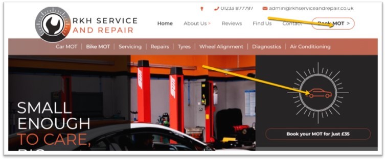
Large ‘Book MOT’ buttons above the fold for this car servicing and repair company:

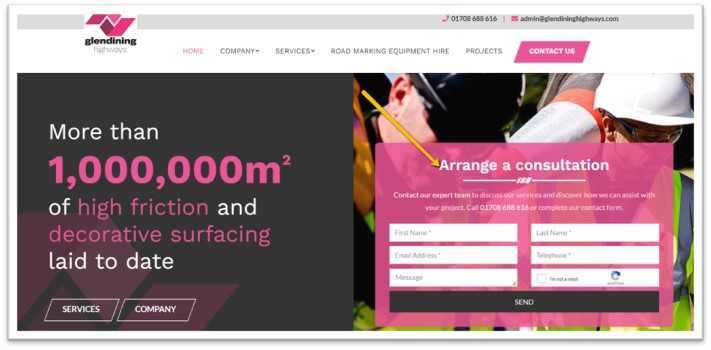
A bold, eye-catching, and clearly visible ‘Arrange a consultation’ form with persuasive language that sits above the fold for this road surfacing company:

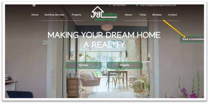
A clear sticky (always visible) button to book a consultation which is visible wherever you scroll to on a page is key to helping this building company gather leads:

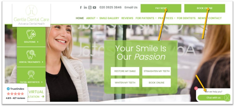
Large CTA buttons which are on a static header i.e. always visible throughout the website combined with the ‘Online Chat’ functionality which is visible on every page, works amazingly for our dental clients:

Feel free to check out the many other examples of our work for more inspiration and ideas. If you are looking for a website that helps you generate more profit or maybe you want to enhance the one you currently have with more effective call to actions and other SEO tweaks, please give us a call to chat everything through – 0800 772 0022.